
System Reports Charts
Understand registration patterns and year-over-year trends using Charts in System Reports, and turn those insights into concrete actions.
What Charts are for
Charts in System Reports turn your registration data into clear visuals so you can see when families register, how each season compares, and whether you are ahead or behind last year.
Use these views to plan marketing, adjust staffing, and make day‑to‑day decisions with confidence.
Charts show trends over time, not individual families. Use them when you want the big picture, not a detailed roster.
Where to find Charts
Use this section when you need to open the Charts screen.
Open System Reports
-
From your admin area, look for a Reports or System Reports option.
-
Select System Reports.
Go to Charts
-
On the System Reports page, look for a Charts option.
-
Select Charts to open the analytics screen.
Choose the chart you need
-
On the Charts screen, look for options such as Registration Patterns and Year Over Year.
-
If available, use any dropdowns to pick the season or comparison you want to view.
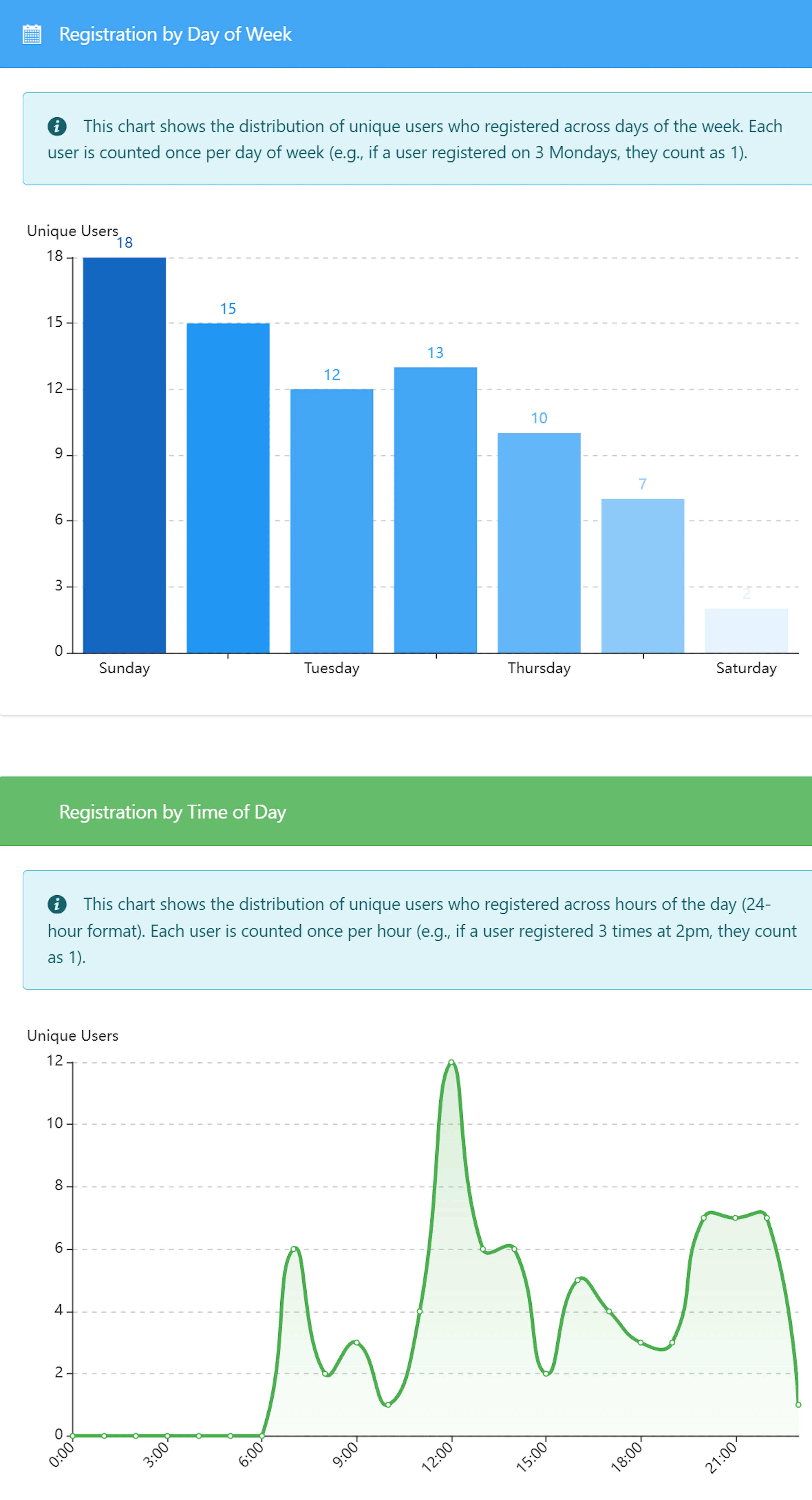
Registration Patterns chart
The Registration Patterns chart helps you understand when families register so you can time your communication and staffing.
What you see on Registration Patterns
When you open the Registration Patterns view, look for:
-
Total Registrations: The number of active registrations in the season you selected.
-
Most Popular Day: The weekday with the highest number of registrations.
-
Most Popular Hour: The time of day when registrations tend to spike.
-
Average Per Day: The average number of registrations per day over the season.
Below the summary, you typically see:
-
Registration by Day of Week bar chart
Shows how many registrations you receive on each weekday (for example, Monday vs. Tuesday). -
Registration by Time of Day line chart
Shows how registrations are spread across the hours in a day. -
Day of Week breakdown table
Lists each day (Monday–Sunday) with the exact counts and percentages. -
Time of Day breakdown table
Breaks registrations into time ranges (for example, morning, afternoon, evening) so you can see the busiest times.
If available, change the season at the top of the chart to compare how registration timing shifts from one year to another.
How to use Registration Patterns
Use these ideas to turn the Registration Patterns chart into actions.
Choosing a season
-
Select the season you want to review, such as your current summer or last summer.
-
If the option exists, switch between seasons to see how patterns change year to year.
Success check: After changing the season, the totals and charts should update to match that season.
Interpreting day‑of‑week patterns
-
Look for Most Popular Day and the tallest bar in the Registration by Day of Week chart.
-
Notice any very slow days that consistently have fewer registrations.
Actions to take:
-
Plan email or SMS campaigns to land one day before your busiest day so families are ready to register.
-
Schedule extra support staff (phone, email, chat) on the most popular day so families get quick help.
-
Use slow days to follow up with families who started but have not finished registering.
Interpreting time‑of‑day patterns
-
Check Most Popular Hour and the highest points on the Registration by Time of Day chart.
-
See whether registrations cluster in the morning, midday, or evening.
Actions to take:
-
Schedule reminder messages (email, SMS, push notifications) to arrive 1–2 hours before your busiest time.
-
Adjust office hours so someone is available to respond during your peak registration hours.
-
Avoid maintenance or system changes during peak times, if you control those schedules.
Year Over Year (Weeks Sold) chart
The Year Over Year chart focuses on weeks sold, so you can compare how two seasons are performing.
What weeks sold means
Weeks sold is a simple way to count how much camp time families have booked:
-
If a camper signs up for one week of camp, that counts as 1 week sold.
-
If a camper signs up for eight weeks of camp across the summer, that counts as 8 weeks sold.
-
Your total weeks sold is the sum of all weeks from all registrations in a season.
This helps you see not just how many registrations you have, but how much camp time you have actually filled.
Selecting seasons to compare
In the Year Over Year view:
-
Select two seasons to compare, such as this summer and last summer.
-
Seasons typically run from August through July, so August is the start of the comparison period.
Success check: After you pick two seasons, the numbers and charts should show both seasons side by side.
What you see on Year Over Year
Look for summary cards and charts that highlight:
-
Total weeks sold for each season
How many camp weeks you sold in each of the two seasons. -
Total registrations for each season
How many individual registrations were created. -
Average weeks per registration
On average, how many weeks each registration includes. -
Percent change between seasons
How much weeks sold, registrations, and averages have increased or decreased between the two seasons.
Below the summaries, you typically see:
-
Monthly comparison chart (Aug–Jul)
Bars for each month from August through July, showing weeks sold per month for each season. -
Cumulative weeks sold timeline
A running total of weeks sold over the full year (up to 52 weeks), with one line per season. -
Cumulative registrations timeline
A running total of registrations over time, again with separate lines for each season. -
Top products by weeks sold
A list or chart of your top camp offerings by weeks sold (often the top 10), so you can see which options are filling fastest.
How to use Year Over Year
Use the Year Over Year chart to understand performance and momentum.
Check overall performance
-
Compare total weeks sold between your two seasons.
-
Look at the percent change to see whether you are selling more or fewer weeks this year.
If your current season shows higher weeks sold and positive percent change, you are outpacing last year.
If the percent change is negative, you are behind last year and may need to intervene.
Find peak months
-
Look at the monthly comparison chart from August to July.
-
Identify the peak months when weeks sold are highest for each season.
-
Notice any months where the current season is stronger or weaker than last year.
Actions to take:
-
Plan early‑bird discounts or special campaigns ahead of your historical peak months.
-
If a usually strong month is weaker this year, send extra reminders or highlight popular programs.
Monitor the pace over time
-
Use the cumulative weeks sold timeline to see how quickly weeks are selling this year vs. last year.
-
Use the cumulative registrations timeline to check whether the number of families is growing, even if weeks per family changes.
Actions to take:
-
If the current line stays above last year, maintain your marketing plan and be ready to add capacity or waitlists.
-
If the current line drops below last year, consider:
-
Sending targeted reminders to past families.
-
Highlighting limited availability to encourage earlier registration.
-
Reviewing pricing or program descriptions that might be slowing interest.
-
Evaluate products and programs
-
Review the top products by weeks sold list or chart.
-
Note which camps or sessions appear in the top 10 and which have dropped.
Actions to take:
-
For top performers, consider:
-
Adding more spots or additional sessions.
-
Featuring them in your marketing as examples of popular choices.
-
-
For lower‑performing offerings, consider:
-
Updating descriptions, photos, or age ranges.
-
Adjusting schedules or pricing.
-
Pairing them in promotions with more popular programs.
-
Dashboard season comparison widget
The dashboard season comparison widget gives a quick snapshot of whether your current season is ahead or behind last year at the same point in time.
Where to see the widget
-
Go to your admin dashboard (the main landing page after you sign in).
-
Look for a season comparison or current vs. last year widget.
If available, the widget usually shows:
-
Current season registrations so far.
-
Prior season registrations at the same time in the past registration cycle.
-
Percent change between the two seasons.
-
Days into registration, which shows how far you are into the current registration period.
How the comparison works
The widget is time‑adjusted. That means it compares:
-
Today in the current season to
-
The same number of days into registration in the prior season.
This way, you see whether you are ahead or behind at the same point in each cycle, not just by calendar date.
Interpreting the widget
Look for:
-
Positive or green percent change: You are ahead of last year at this point.
-
Negative or red percent change: You are behind last year at this point.
-
Flat or near zero change: You are tracking close to last year.
Actions to take when:
-
You are ahead:
-
Plan for higher capacity or longer waitlists.
-
Confirm you have enough staff and supplies for the expected numbers.
-
Consider raising awareness of sessions that still have space.
-
-
You are behind:
-
Review your communication schedule and send extra reminders.
-
Highlight popular programs or offers that worked well last year.
-
Reach out to returning families who have not yet registered.
-
-
You are flat:
-
Maintain your current plan, but watch for any early signs that you are starting to move ahead or fall behind.
-
Use the detailed Registration Patterns and Year Over Year charts to dig deeper if needed.
-
How these reports work together
Use all three views together to get a full picture of your season.
Start with the dashboard widget
-
Look at the season comparison widget on the dashboard to see if you are ahead, behind, or on track versus last year.
-
Decide whether you need to take action or simply continue monitoring.
Check Year Over Year for depth
-
Open System Reports → Charts and select the Year Over Year view.
-
Confirm how weeks sold, registrations, and top products compare between seasons.
Use Registration Patterns to time actions
-
Switch to Registration Patterns to see which days and times families register.
-
Schedule marketing messages and staffing based on most popular days and hours.
Adjust and repeat
-
After you run a campaign or make a change, check the charts again in a few days.
-
Look for shifts in weekly trends, peak times, or weeks sold to see if your changes are working.
Tips and best practices
Use these tips to get the most value from Charts.
-
Review charts regularly
Set a habit to check the dashboard widget weekly during your busy registration period, and review the Charts screen at least once a month. -
Compare similar seasons
When using Year Over Year, compare seasons that have similar programs (for example, summer to summer) for clearer insights. -
Watch both counts and timing
Look at how many weeks you sell and when people buy them. Both matter for staffing and cash flow. -
Plan around your peak times
Focus your team and communication during the days and hours when families are most active in registering. -
Document what works
When you find a successful pattern (such as a strong email day), note it so you can repeat it next season.
If you make a big change, such as new pricing or a new program, mark the date on your own calendar. Then look for changes in the charts shortly after that date.
Troubleshooting and common questions
-
First, confirm that you selected the correct season at the top of the chart, if that option is available.
-
Check that registration for that season has actually started and that families can enroll.
-
If you still see no data, try switching to a different season to confirm that charts can load data at all.
-
If all seasons show empty charts even though you know you have registrations, contact your support team.
-
Use the Registration Patterns chart to find the best day and time to send extra reminders.
-
Review Year Over Year to see which months are lagging and which products are underperforming.
-
Focus a short campaign on:
-
Returning families from last year who have not yet registered.
-
Highlighting your top products and any limited spots remaining.
-
-
After the campaign, recheck the dashboard widget and Year Over Year chart to see if the gap is closing.
-
If weeks sold are up but registrations are similar, it usually means families are booking more weeks per camper.
-
This can be positive for revenue, but it may mean:
-
Fewer unique families are attending.
-
Some sessions might fill earlier, increasing waitlists.
-
-
Consider:
-
Promoting entry‑level or shorter options to attract new families.
-
Watching capacity carefully to avoid over‑booking popular weeks.
-
-
A strong spike can be normal, especially when you open registration or run a big promotion.
-
If spikes create pressure on your staff:
-
Use Registration Patterns to understand which days and times are most intense.
-
Stagger announcements or offer priority windows to different groups to spread demand.
-
Ensure you have extra support available during peak times.
-
-
Schedule a quick review meeting during your busy season.
-
Show:
-
The dashboard widget for a quick status.
-
The Year Over Year chart to compare overall performance.
-
The Registration Patterns chart to discuss staffing and communication timing.
-
-
Agree on one or two actions to try before the next check‑in, and then use the charts to measure the results.